How to Customize the Appearance of your Reviews Widget
Your Reviews widget plays a key role in your website's overall appearance. With Elfsight, you can easily tailor it to match your brand’s style. In this guide, we’ll walk you through the tabs that let you personalize your widget’s design.
In this article
Display AI Summary
In the AI Features tab, enable AI-Generated Summary to automatically generate a short highlight of your reviews. Choose your preferred Summary Style and toggle Text Typing and AI Picture Animation on or off:

You can also display reviews in your selected widget language! Simply enable the Translate Reviews with AI toggle. Your site visitors will be able to view the original review text in the popup:
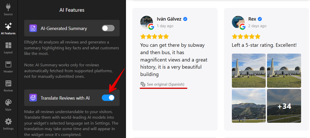
Please note that the Translate Reviews with AI feature is available for Pro plans and higher.
Configure Widget Layout
In the Layout tab, you can select how reviews are displayed — Carousel, Masonry, Slider, Grid, List, Reviews Button, Review Request, Card or Compact Badge (to see all available options, click See All Layouts):

After choosing a layout, the Customize section specific to that layout will appear below. For example, Grid lets you set columns and rows, while Card Badge allows you to choose a display mode and adjust the floating panel’s appearance:

Choose Header Elements
In the Header tab, you can customize the top section of your widget by choosing which elements to display. This includes options to show a title, overall rating, number of reviews, the 'Write a Review' button, and more:

Use the toggle next to Widget Title to show or hide the title. When enabled, you can edit the heading in the Title field and add a message in the Caption field:

Select Review Style
In the Review tab, you can control how review cards are displayed and which elements are shown:

Click Customize to choose which review elements appear in the widget. You can show reviewer's name and photo, display review source and date, and include verified badges and star ratings:

The Google source also supports reviewer images and business owner replies! 🚀 Here's how it looks in the widget:

Under Reviewer Name Format, you can choose how customer names are displayed (full name, first name only, initials, or other formats):

The How to Display Review Text option lets you choose whether to display the full review text or a short preview. You can set the preview length and use Align Cards by Height to keep the layout neat and consistent:

Adjust Colors, Fonts, and More
Use the Style tab to help your widget blend seamlessly into your website’s design. For example, you can choose a color scheme that matches your site, set an accent color, and pick a font:

You can also adjust colors, spacing, and typography for key elements. The available options may vary depending on the layout you choose:

Here are some examples of the adjustments you can make:

Need more customization? You can add your own CSS to the Custom CSS section. If a styling choice you need isn't available, check out our community post for handy CSS codes to enhance your widget even further!
We hope this guide helped you customize your Reviews widget to fit your website perfectly. If you need more design options or extra customizations, just contact our Support Team. We’re here to help!🧝