How to Optimize Your YouTube Gallery for Mobile
Your YouTube Gallery widget is mobile-friendly by default, but Mobile Optimization lets you fine-tune the layout so it looks perfect on tablets and phones. ✨
Follow these steps to customize how the widget appears on mobile devices:
- 1
-
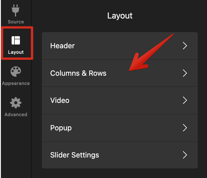
Open the layout settings
In the widget editor, go to the Layout tab and select Columns & Rows: -
- 2
-
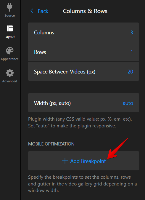
Add a breakpoint for mobile devices
A breakpoint is a screen width where the widget switches layout. Create one in the Mobile Optimization panel by clicking ➕ Add Breakpoint: -
- 3
-
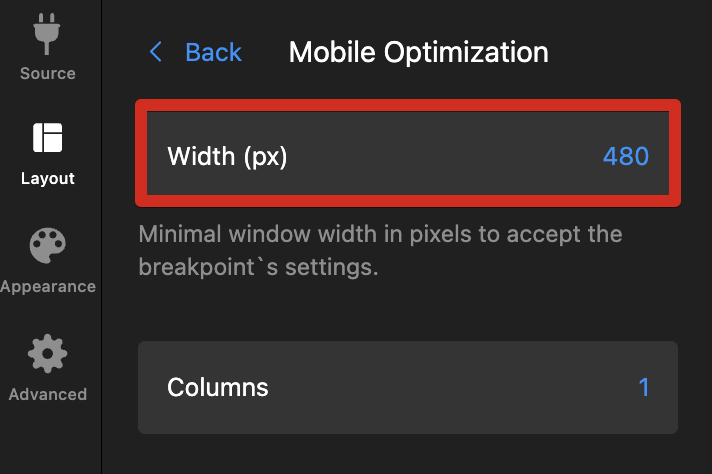
Set your breakpoint width
Choose a pixel value for the Width. For example, setting 480px means the mobile layout will apply on screens 480px wide or smaller, while larger screens will continue to display the desktop layout: -
- 4
-
Customize your mobile layout
In the editor, switch to Mobile Mode to preview your gallery and adjust the columns, rows, and thumbnails spacing: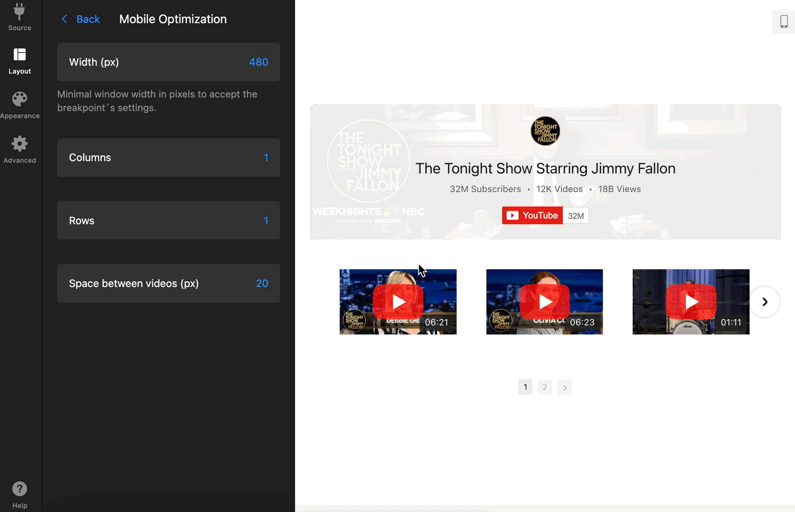
Here are our recommended breakpoints for best results:
- 1024px (for tablets in landscape orientation) — works best with 3 or 4 columns.
- 768px (for tablets in portrait orientation) — works best with 2 or 3 columns.
- 480px (for mobile phones) — works best with 1 or 2 columns.


Set multiple breakpoints to make your YouTube Gallery shine on every screen and enjoy a layout that looks perfect on all devices! 😊
Need more guidance? Contact our Support team for assistance.