Step 1: Build Out Your Form
The Form Builder widget lets you easily collect the information you need from your visitors. Use it for contact forms, feedback, bookings, surveys, and more!
Setting up your Form Builder widget is simple and takes just a few steps. You’re currently on:
In this article
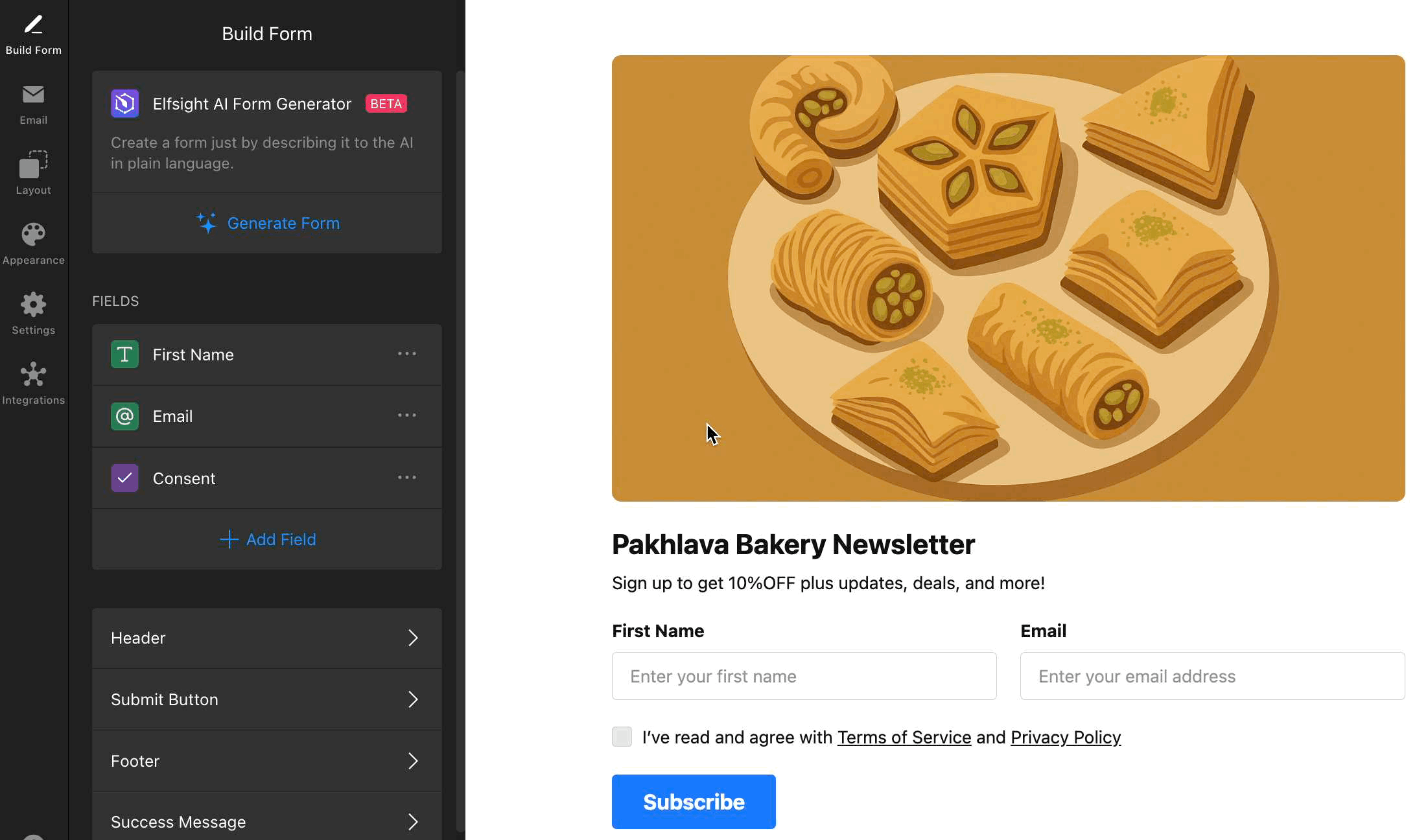
AI Form Builder
Want to create a form in seconds? Try the AI Form Generator! Just describe your form in plain language and let AI do the work.
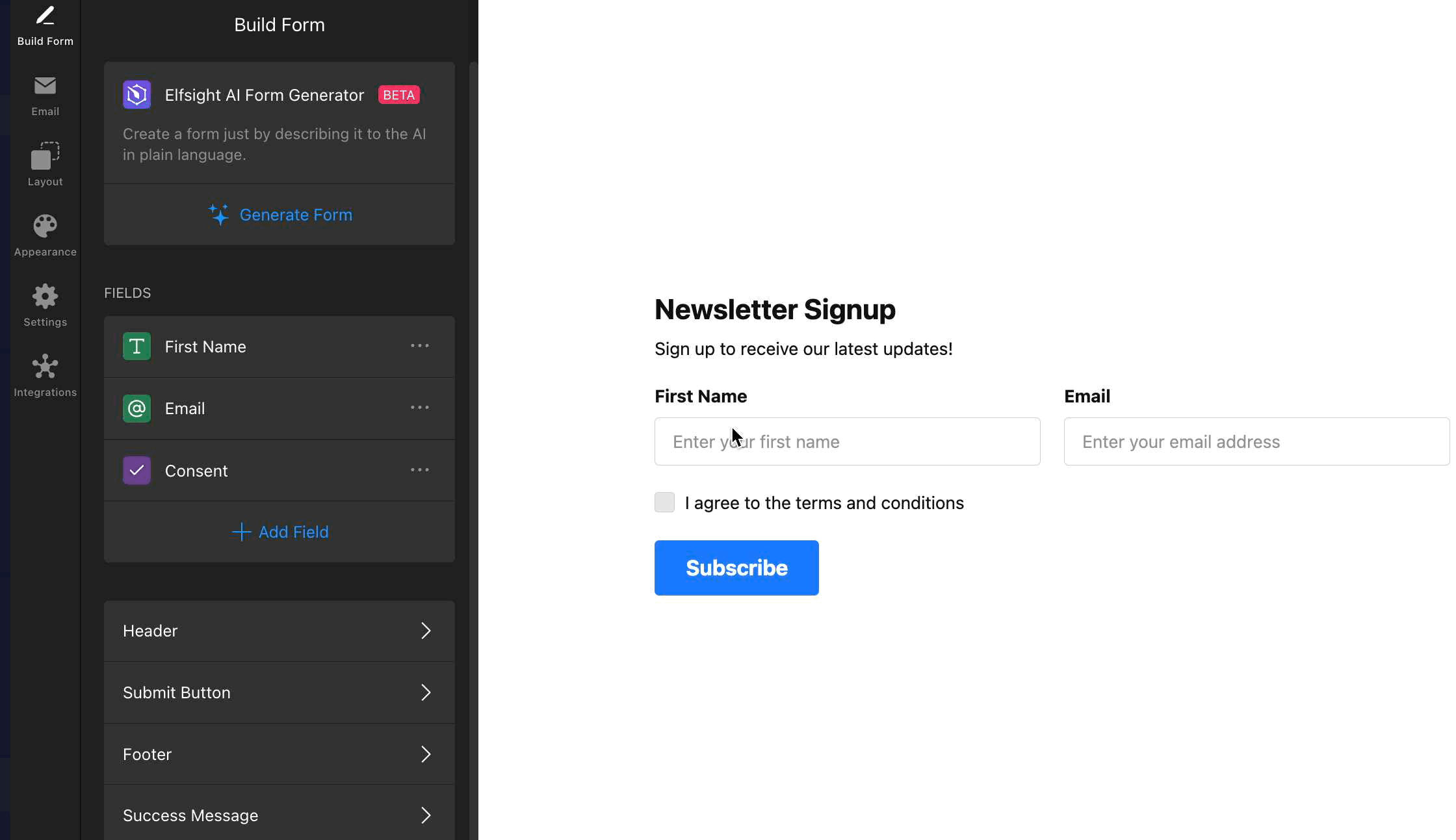
To use the AI Form Generator, go to to the Build Form tab and click Generate Form:

In the Generate Form field, type a description (e.g. "Contact form with name, email, message, and consent.") You can also specify the type of form you want, such as "product feedback form" or "hotel booking form," and describe the fields you need by listing their names, data types, options, etc. Once ready, click Generate:
Single Page vs. Multistep Form
Before adding form fields, decide whether you'd prefer a single-page or a multistep form. A multistep form divides your form into smaller, manageable steps, making it ideal for long forms, surveys, or a smoother user experience.
Single-page forms are the default, but you can easily switch to multistep by going to the Layout tab and selecting Multistep under Form Layout:

If you pick Multistep, your form will automatically be split into two pages. You can also add more pages or fields as needed:
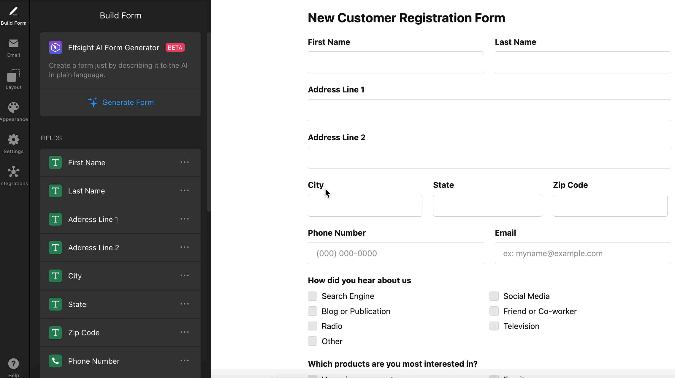
Add Fields To Your Form
Build your form by adding all the fields you need. Click Add Field in the Build Form tab, and choose from a variety of field types, such as text, email, phone, dropdown, rating, and more. To make a field mandatory before submission, toggle the Required Field option:
You can also Duplicate form fields, Rearrange them using drag & drop, and Delete fields in the Build Form tab:
Customize Form Elements
After you add your form fields, you can edit other components of your form to match your site’s voice and layout. Here are the available elements:
Header
The Header section allows you to add a title and caption to your form, helping visitors understand its purpose. You can also upload a cover image and logo to create a branded, engaging look.
To enable the Header, go to the Build Form tab → Header → toggle it on:

- Title – the main heading at the top of your form.
- Caption – a short description or instruction under the title.
- Cover Image – add an image above your form (upload from your device or URL).
- Logo – upload your logo to reinforce your brand (upload from your device or URL).
- Alignment – choose how text and images are aligned (left, center, right).
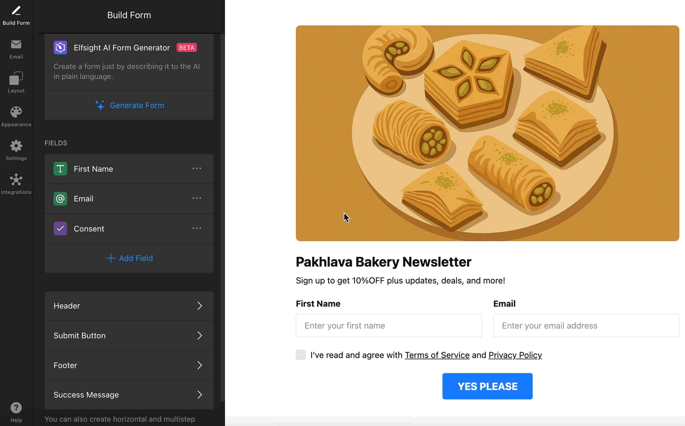
Submit Button
Customize the text and alignment of your form’s Submit Button:
Footer
Add extra information or links (like privacy policies or contact info) to the form’s Footer. Enable or disable it as needed:
Success Message
Use the Success Message to thank users, confirm receipt, or guide them on next steps after form submission:

Customize your message in the Build Form tab → Success Message:

- Title – add an optional heading to your success message.
- Text – the main message displayed after submission.
- Close Button – allow users to close the success message manually.
- Button Text – customize the label for the close button (e.g., “OK”).
- Alignment – control how the success message content is aligned.
That’s it! 🎉 You’ve just built the base of your form. Next, you’ll learn how to connect your form to email and integrate it with your favorite tools.