Step 3: Customize Contact Form Layout & Appearance
Now that your Contact Form is ready, let’s make sure it fits perfectly with your website’s style. In this step, you'll learn how to choose the form’s layout, customize its appearance, and ensure it aligns perfectly with your brand.
- Step 1 – Build Out Your Contact Form
- Step 2 – Set Up Email Notifications & Integrations
- 👉 Step 3 – Customize Contact Form Layout & Appearance
- Step 4 – Adjust Display & Advanced Settings
In this article
Embed Types & Layouts
The Layout tab allows you to choose between two ways to display your form:
- Inline – The form is embedded directly into your page’s content. Ideal for contact, feedback, or sign-up forms that you want users to see without extra clicks.
- Floating Pane – The form slides in over your website, either from the left or right. Great for popups or contact panels!
Inline Form
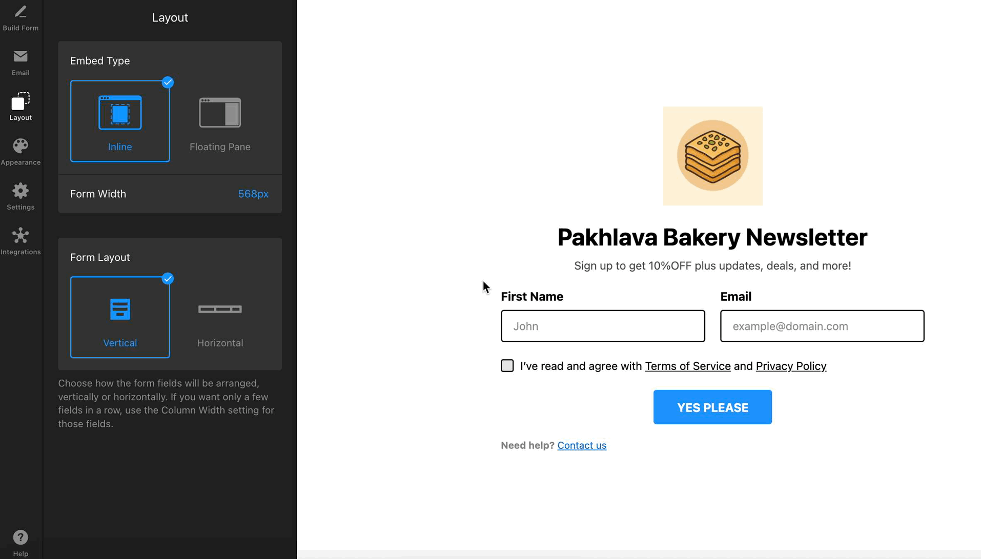
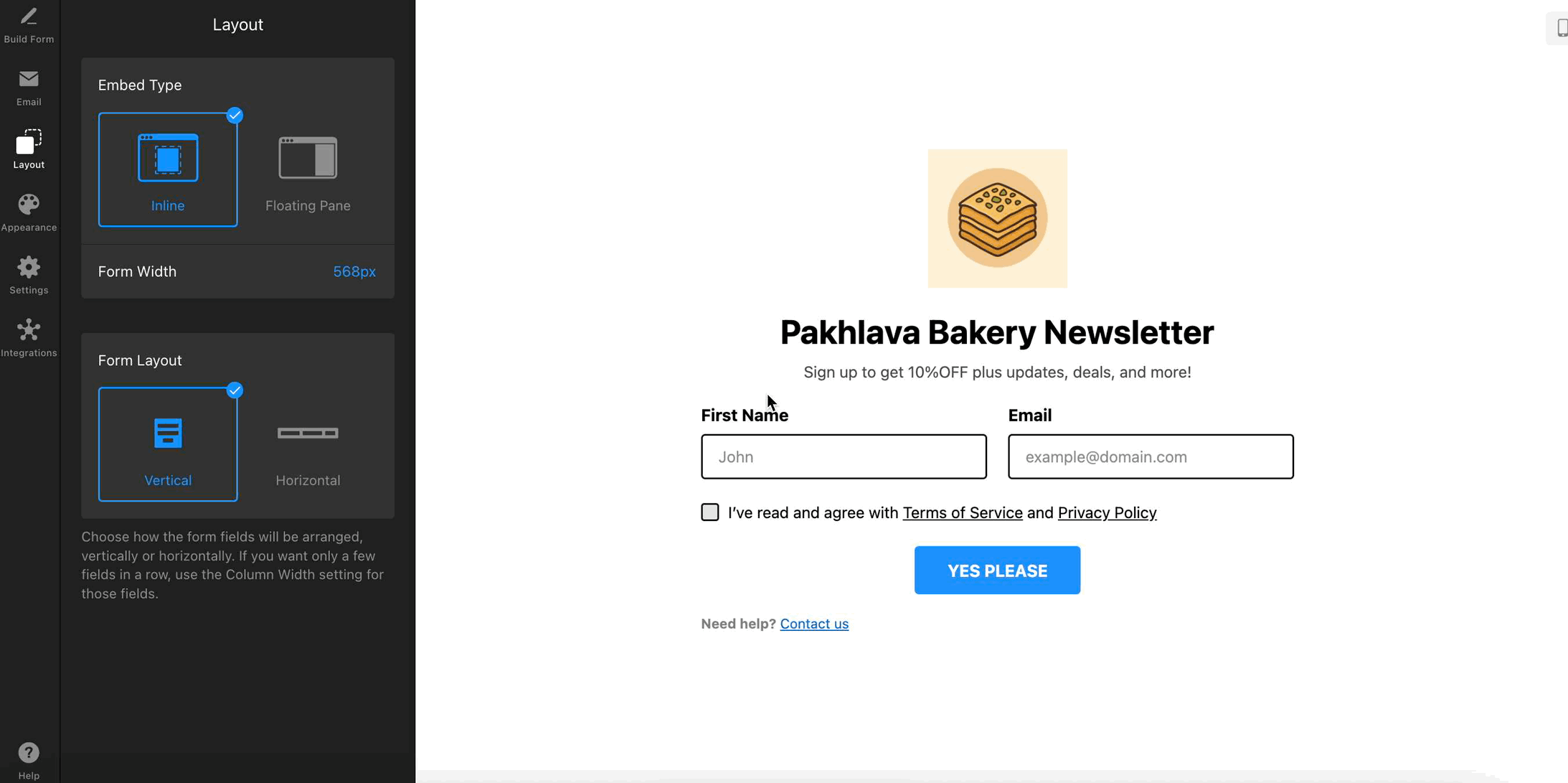
If you'd like your form to appear directly within your page’s content, choose the Inline option in the Layout tab: 
The Form Width setting lets you adjust the width of your form on the page. You can either drag the slider to set a custom width (from 100px to 1200px) or enable Full Width to stretch the form across its container: 
In the Form Layout section, you can also choose whether to arrange the fields vertically or horizontally:
Floating Pane
Want your form to slide in and grab attention without taking up space on your page? Select the Floating Pane option in the Layout tab: 
In this layout, you can adjust:
- Pane Position – Choose which side of the screen your form will appear from—right or left.
- Form Width – Adjust the width of the floating pane.
- Pane Reopen Button – Allow visitors to reopen the form after closing it. You can customize the icon, button text, and position it anywhere on the screen:
Customize Colors, Fonts, and More
Use the Appearance tab to make your form match your website's style. You can customize the overall look of the widget as well as fine-tune fonts and colors for specific elements.
For example, you can choose a Light or Dark Color Scheme to match your site, set an Accent Color for buttons and links, select a Font, and apply a form field template to control their shape, borders, and overall look:
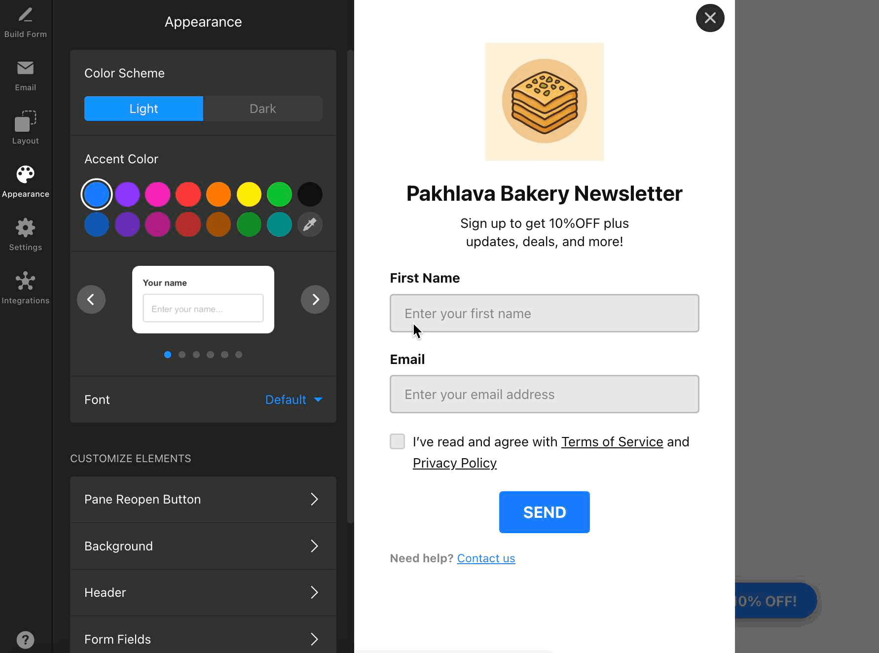
For full control over your form’s design, use the Customize Elements section. The available settings may vary depending on the layout you choose: 
Here, you can tweak every aspect of your form, like Background, Header, Form Fields, or Pane Reopen Button for floating forms. Adjust colors, sizes, spacing, button shapes, and more for each element: 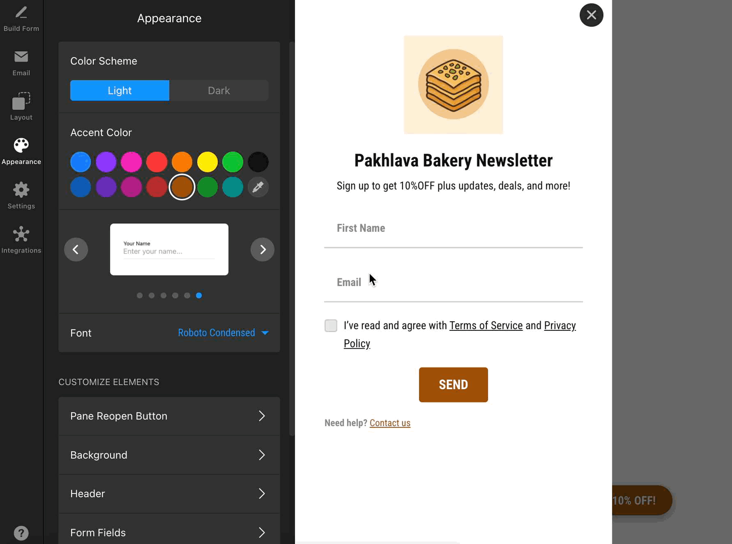
Need even more customization? You can add your own CSS in the Custom CSS section. For extra styling ideas, visit our community post with handy CSS codes 😊
That’s it for customizing your form’s layout and appearance! Take a moment to preview your changes and ensure your form blends seamlessly with your website.