Step 1: Build Out Your Сontact Form
Use the Contact Form widget to make it simple for your visitors to get in touch. Gather questions, feedback, and requests directly from your website!
Setting up your Contact Form widget is simple and takes just a few steps. You’re currently on:
- 👉 Step 1 – Build Out Your Contact Form
- Step 2 – Set Up Email Notifications & Integrations
- Step 3 – Customize Contact Form Layout & Appearance
- Step 4 – Adjust Display & Advanced Settings
In this article
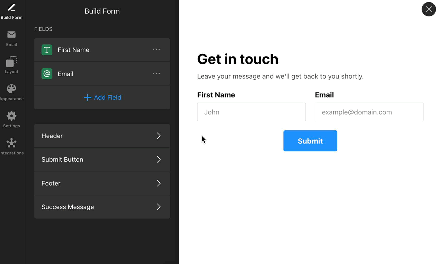
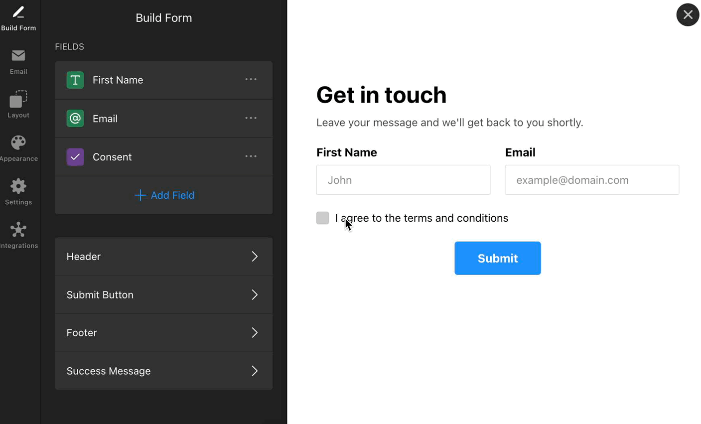
Add Fields To Your Form
Add the fields you need by clicking Add Field in the Build Form tab. Choose from a variety of field types, such as text, email, phone, dropdown, and more. To make a field mandatory before submission, toggle the Required Field option:
You can also Duplicate form fields, Rearrange them using drag & drop, and Delete fields in the Build Form tab:
Customize Form Elements
After you add your form fields, you can edit other components of your form to match your site’s style. Here are the available elements:
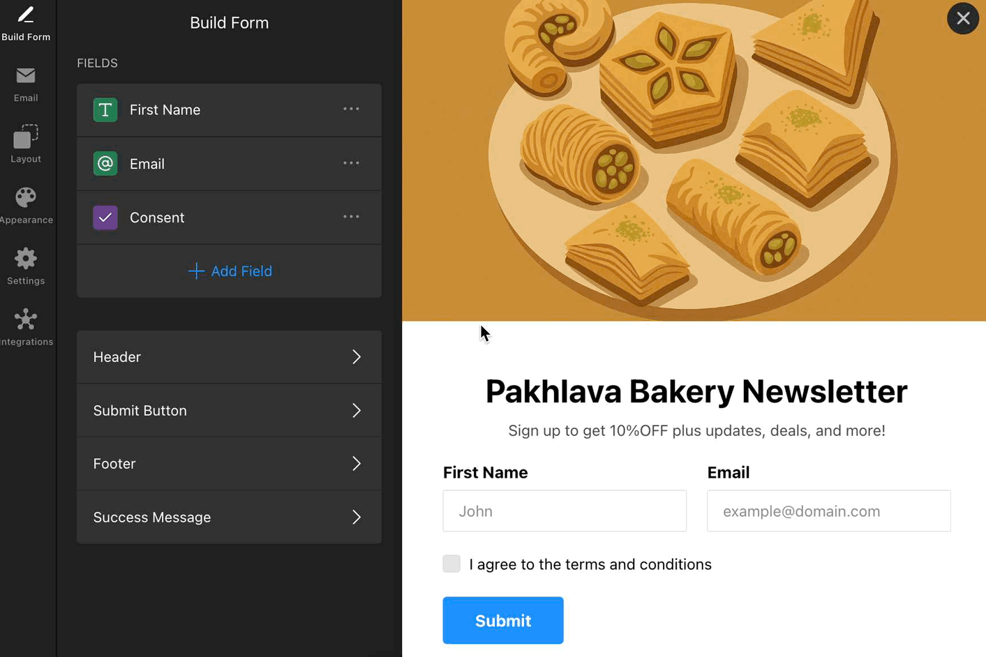
Header
The Header section allows you to add a title and caption to your form, helping visitors understand its purpose. You can also upload a cover image and logo to create a branded, engaging look.
To enable the Header, go to the Build Form tab → Header → toggle it on:

- Title – The main heading at the top of your form.
- Caption – A short description or instruction under the title.
- Cover Image – Add an image above your form (upload from your device or URL).
- Logo – Upload your logo to reinforce your brand (upload from your device or URL).
- Alignment – Choose how text and images are aligned (left, center, right).
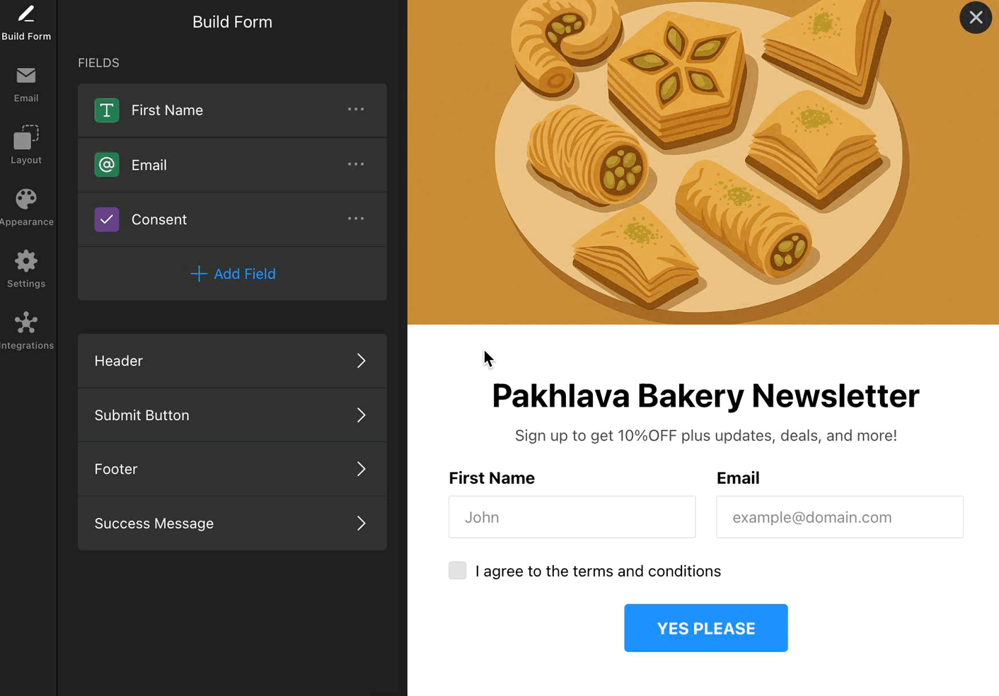
Submit Button
Customize the text and alignment of your form’s Submit Button:
Footer
Add extra information or links (privacy policy, contact info, etc.) to the form’s Footer. Enable or disable it as needed:
Success Message
Use the Success Message to thank users, confirm submission, or guide them on the next steps:

Customize your message in the Build Form tab → Success Message:

- Title – Add an optional heading to your success message.
- Text – The main message displayed after submission.
- Close Button – Allow users to close the success message manually.
- Button Text – Customize the label for the close button (e.g., “OK”).
- Alignment – Control how the success message content is aligned.
That’s it! 🎉 You’ve just built the base of your form. Next, you’ll learn how to connect your form to email and integrate it with your favorite tools.