Types of Elements Available with Contact Form
Learn how to effectively use the Contact Form widget by exploring its various elements, including inputs, static text fields, and interactive fields. This guide provides a concise overview of each element's purpose and customization options.
In this article
Form Elements Available with Contact Form
Form elements are the building blocks of your form. Our Contact Form offers three types of elements, each serving different functions and identified by unique colors:
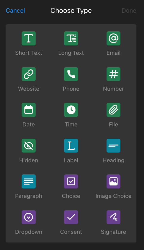
To access these elements, open your widget configurator and click ➕Add Field on the Build Form tab:

Now, let's take a closer look at each type of element.
Inputs
These green-colored elements allow you to specify what information you need from your visitors. There are ten types of elements in this group:

- Short Text: For short text entries
- Long Text: For longer text entries and descriptions
- Email: To collect visitor email addresses
- Website: To collect visitor website URLs
- Phone: To collect visitor phone numbers
- Number: To collect numerical information
- Date: For getting any specific date from your visitors
- Time: For getting the exact time from your visitors
- File: For allowing users to attach files such as documents, images, or videos
- Hidden: For internal tracking (this field is invisible to users but visible to you when receiving form submissions)
Each of these types has additional settings for customization, such as adding specific text, making fields required, selecting width, or setting field visibility based on other field values:

Static Text Fields
This blue-colored group allows you to add text and other elements to specific locations in the widget:
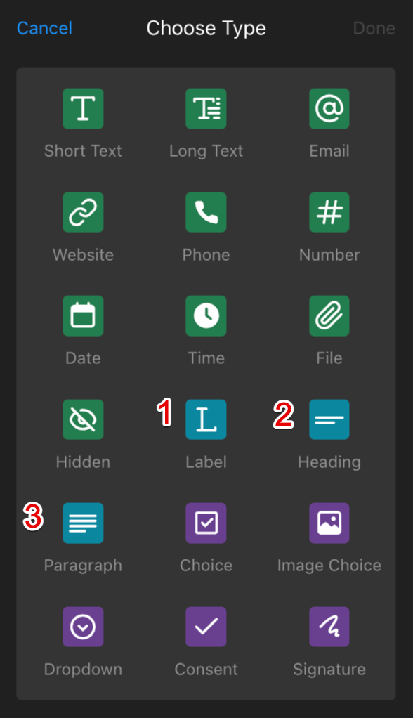
- Label: Use it when you need to add text to grab visitors' attention
- Heading: Similar to the label but with larger text, useful for section headers
- Paragraph: Use it for adding plain text, including links, and bullet lists
These types also offer settings for customization, including text, width, and field visibility based on other field values:

Interactive Fields
This purple-colored group allows users to make selections or provide direct input, such as choices, consent, or digital signatures: 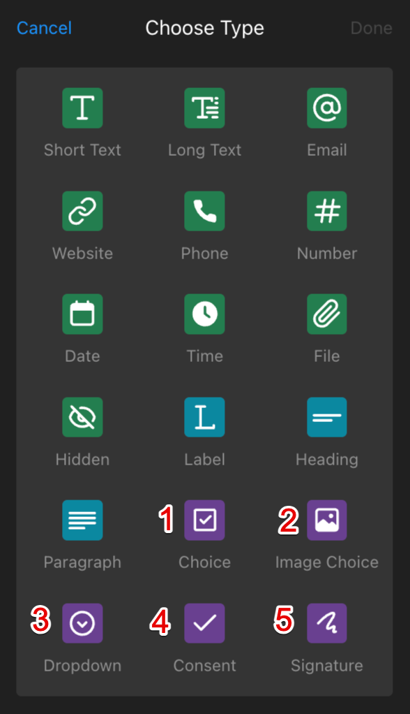
- Choice: Use it for multiple choice options
- Image choice: Similar to Choice, but allows for image-based options
- Dropdown: For displaying options in a dropdown list
- Consent: Use this field if you need to get visitor consent
- Signature: Lets users sign the form digitally
These elements also have additional settings for customizing the selection options:

Mastering the Contact Form widget elements allows you to create effective, user-friendly forms. Use these tools to enhance visitor engagement and simplify data collection.
If the current options in our Contact Form app are not enough, check out our Form Builder app, which offers a wider range of functionality and types of elements 😊