How to Change Default Texts in Form Builder
Want to change the default texts in your Form Builder widget? It’s super easy! This guide will show you how to adjust your form’s text to fit your website’s tone perfectly. 🙌
In this article
Customizable Texts in Your Form
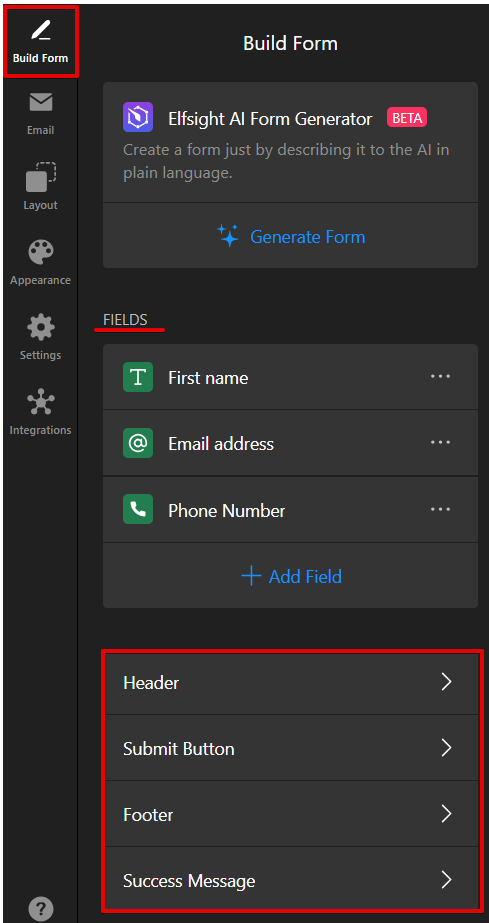
In the Built Form tab, you can find different types of text elements that you can easily customize. This includes editing the form's labels, buttons, and messages:
We'll take a closer look at the settings in this tab below.
Fields & Inputs
The Fields are input areas where users can enter text, select from dropdown options, check boxes, and more. You can easily modify these fields to collect exactly what you need from your users.
To update the main texts displayed in the form, simply click on the content you wish to change in the Built Form tab and edit the Label field:

In addition to the main texts, you can also customize placeholders. Placeholders are the default text displayed in the form fields to guide users, often disappearing once the user starts typing.
You can change the placeholder text on the same page in the Placeholder field:

Header
The Header is the title or main heading of your form, typically used to describe its purpose or what the user is expected to do.
You can enable or disable your widget's header by clicking on the corresponding toggle. When it's enabled, you can edit the header's title and caption:

Submit Button
The Submit Button is the button users click to send their form data. You can customize its text and alignment in the section's settings:

Success Message
The Success Message is shown after a form is successfully submitted, thanking the user or giving further instructions.
You can change the message heading, main text, hide or show the Close button, and edit the button label:

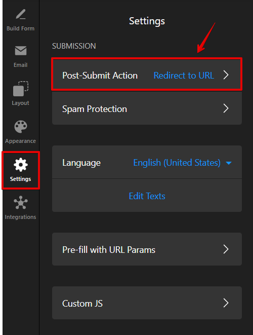
If you prefer not to show the Success Message after form submission (for example, if you want to redirect users to another page), you can easily set this up in the Settings tab under Post-Submit Action:
Footer
The Footer is the section at the bottom of the form, often used for additional information or links, such as privacy policies or terms of service.
You can enable or disable the footer by toggling the button. When it's enabled, you can customize the footer content:

Form Elements and Error Messages
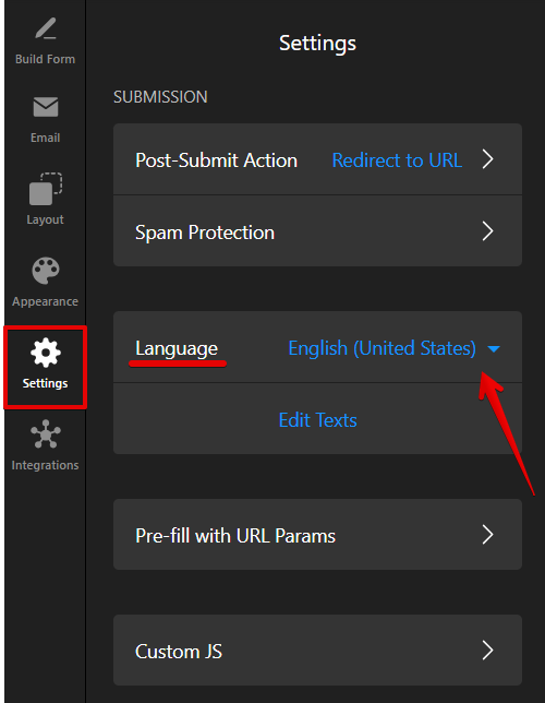
If you'd like to change the text or language of the default labels in your form, you can do so in the Settings tab.
For example, to make error messages appear in the same language as your form’s content, click the Language dropdown and select the language you need:
Don't like our pre-filled form elements, such as warnings, captcha description, or form progress steps, if you use a multistep form? No worries! You can easily edit them by clicking Edit Texts. Find the text you’d like to change and replace it with your own:

That's it! We hope this guide helped you customize texts in your Form Builder widget. If you need further help or have any questions, don’t hesitate to contact our Support team!