Getting Started with Calculator Widget
With our Calculator widget, your website visitors can effortlessly tackle complex math tasks directly on your site - whether it's calculating prices or managing mortgages. Setting up the widget is pretty easy, especially if you're familiar with spreadsheet editors like Excel.
If you're feeling confident about setting up the visual interface and want to skip ahead to writing formulas, check out this article - Working with Formulas in Calculator widget.
In this article
Easy Start with Templates and AI Calculator Generator
Creating a widget from scratch can seem scary and take a lot of time. Don't worry! We have two great solutions to help you make a calculator quickly and easily.
- 1
-
Templates
When you first create a widget, you'll be offered many ready-made templates for popular cases like Product Price Calculator, Shipping Rates Calculator, Mortgage Calculator, and more:

Look through the options, pick the one you need, and click Continue with this template. It's that simple!
- 2
-
AI Calculator Generator
Another helpful tool is the AI Calculator Generator. It uses AI to automatically create fields, content, and formulas using everyday language.
If you go with the AI option, just click ✨ Generate Calculator on the Build tab of the widget → write your prompt → click Generate → Start Generation:

Wait a moment... And that's it! Your widget is ready:

Don't be afraid to re-generate the calculator if the result isn't perfect. Clarify details and find your own way to create calculators.


In the next section, we'll also show you how to add fields and calculations manually if your widget needs a personal touch.
Adding Calculator Fields
To allow visitors to input data, you'll need to create a visible interface. To do that, navigate to the Build tab of the widget editor and choose the Fields that best suit your use case:

Our widget offers a choice of 6 field types:

-
Slider - provides an intuitive interface for users to select values within specified limits. Here, you can easily set the minimum and maximum values to customize the range.
-
Number - enables users to input any numerical value of their choice.
- Dropdown - offers various options for users to select from. Each option should have a visible label for the user and an associated value for calculations.
-
Choice - presents a list of options with visible labels and corresponding hidden values. This field type supports both radio buttons (allowing selection of only one option) and checkboxes (enabling Multiple Selection).
- Image Choice - offers the same functionality as the Choice field, but allows you to include an image as well. For this field type, you can also use radio buttons and checkboxes.
-
Heading - serves as a decorative element to help you divide your form into sections.
Each field comes with conditional logic support, allowing you to dynamically show or hide a field based on user responses in other fields.
After adding the required fields, it's time to write formulas to process the data collected from users.
Adding Calculations
A Calculation is the key component of the widget where you add formulas to process user-provided data and generate results. To display any outcome within your widget, you'll need to create at least one Calculation.
To get started, navigate to the Build tab and click on Add Calculation:

In the context menu that appears, you can configure your calculation using the following features:
- 1
-
Name
Naming your calculation is optional. However, consider adding it if you plan to create multiple calculations or aim to present the result clearly to the user:

- 2
-
Formula
Here, you bring together all the data and specify how it should be processed to get the final result.
Before you write your formula, you won't see any results in the widget's designated section. But once you've written the formula, the result will show up and change as the data is updated:

As you can see, the editor offers various building blocks for writing formulas. Some are easy to use, while others may need a bit more understanding.
For guidance on crafting formulas using Fields, Calculations, and Functions, please take a look at this article - Working with Formulas in Calculator widget. - 3
-
Styling options
The final section of the Calculation editor focuses on styling how your calculation’s output appears in Results.
Here are the available settings:
-
The Show in Results toggle allows you to hide or show the output:

-
The Primary Result / Secondary Result modes visually indicate the relative importance of the result to the user:

-
The Format options display your output as a Number, Currency, or Percentage:

-
Caption adds any additional information about the calculation that you find necessary:

-
Divider adds a horizontal ruler useful for visually separating related sets of calculations:

-


Nicely done! Now that everything's set up, the widget can handle input and crunch numbers. Next up, let's style the calculator to give it that finishing touch.
Styling the Widget
You can improve the widget's appearance using styling options available in various tabs of the widget editor.
- 1
-
The Build tab allows you to add Header (1) and Results Section (2):

- Header includes a Title and a Caption appearing at the top of the widget:

- Results Section consists of a Section Heading and a Footer:
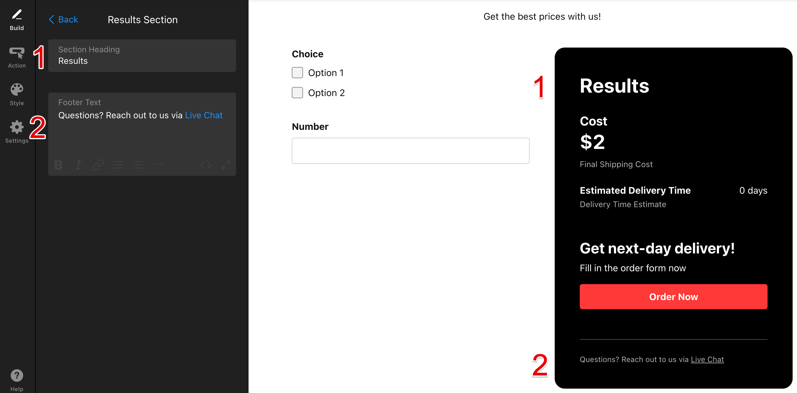
- Header includes a Title and a Caption appearing at the top of the widget:
- 2
-
On the Style tab, you can customize the following details:
- Input style and Font:

- Other elements such as Background, Text Color, Accent Color, Results Background Color:

- Input style and Font:
- 3
-
On the Settings tab, you can also adjust the Thousands Separator, Decimal Separator and the Width of the widget:

For more advanced users comfortable with coding, we offer Custom CSS and Custom JS fields for further customization. Feel free to check out our community post for handy CSS codes to take your widget to the next level 🚀


Now that you've learned how to make the widget work and look nice, you're all set to create your first Calculator.
Feel like our widget is missing an important feature? Please do not hesitate to add your request to our Wishlist. Your feedback is super important to us 🙌