Guide to CSS Codes for Elfsight Widgets
Elfsight widgets come with a wide range of built-in customization settings, covering most styling needs. However, if you want more control, you can use CSS (Cascading Style Sheets) to fine-tune styles and make your widget perfectly match your website.
In this article
Understanding CSS and Elfsight classes
CSS is a style sheet language used to control the layout of a website. While HTML handles the structure and content (like text, images, buttons), CSS controls how those elements appear — from colors and fonts to spacing and layout.
CSS works by selecting HTML elements and applying styles to them. You can target elements using their HTML tags, classes, or IDs.
So, how do you apply CSS to your Elfsight widget? First, let's look at the widget HTML code structure to identify the classes used. The class names are located within the class="" attribute in the widget's code: Keep in mind that not all classes in the code can be used for CSS. Let’s explore this in more detail.
Stable vs. Temporary Classes
Stable Classes
When writing your CSS, always choose a stable class name—these are predictable and won’t change. They usually look structured and readable, such as es-title, es-button, or es-description:
 To target a class like this, just add a dot before its name (e.g.
 .es-title). For example, in Instagram Feed you can use .es-post { border-radius: 3px; } to round the corners of the posts.
If your widget includes es- classes, always use them. These are the most reliable selectors.
Temporary Classes
Some classes in the widget code are temporary. These are auto-generated, can change at any time, and may break your customization. Temporary classes often look like this:
- Random character strings like
dgCyQRorfLyMPb: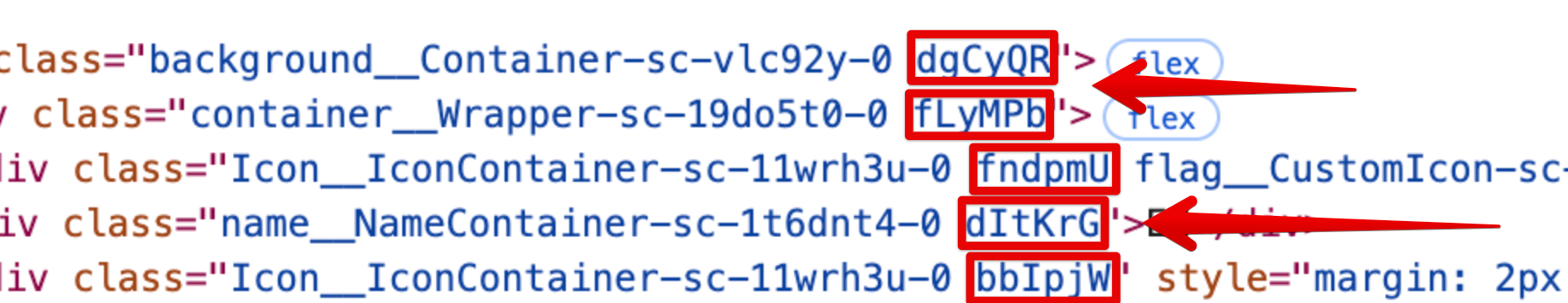
- Some class names may combine stable parts (e.g.,
Icon__Container-sc) with temporary suffixes (e.g.,-11wrh3u-0):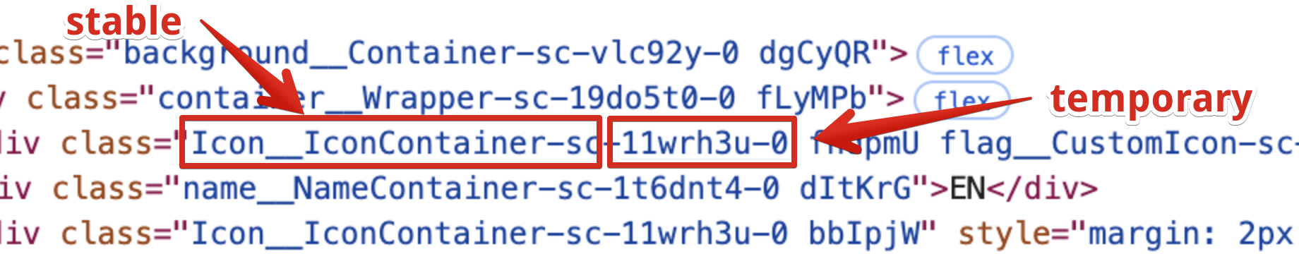


Avoid using temporary classes like dgCyQR or -fad1af6-0. In case of a combination class name, use the stable base part.
For combined class names, target the stable part using [class*="stable-part"]. This ensures your styles remain applied even if the full class name changes.
For example, to change the button text color in the Calculator widget, you can use: [class*="ButtonBase__Ellipsis-sc"] {color: #fff}.
How to Create CSS for Your Widget
Now that you know the basics, let’s create a CSS rule! As an example, we’ll change the background color of the dropdown menu in the Website Translator widget.
- 1
-
Open the widget editor
In your Elfsight Dashboard, click Edit next to your widget. You’ll be able to preview your widget as you work on its styles: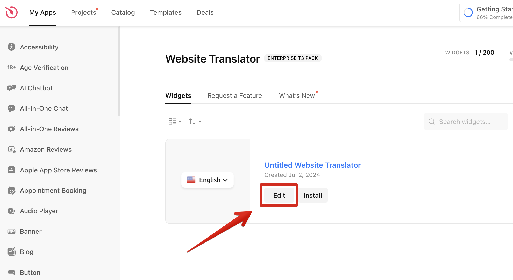
- 2
-
Inspect the widget with DevTools
Open DevTools on the Elements tab (Ctrl + Shift + C on Windows and Cmd + Option + C on Mac) and hover over the widget element you want to inspect. This will highlight the element’s HTML code and styles in the DevTools panel: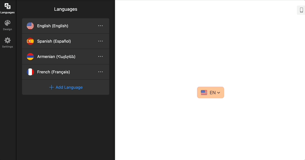
- 3
-
Copy the class of the element you want to customize
Once you find the desired element, click on it and copy its class name: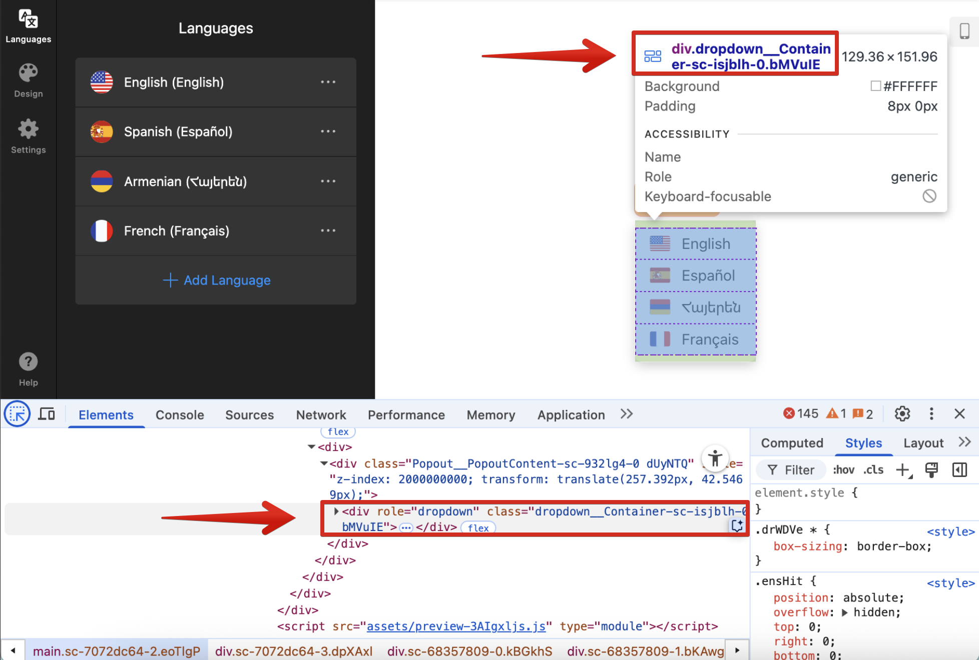
- 4
-
Add the class selector to Custom CSS
In the editor, go to the Style/Appearance or Settings tab → Custom CSS section and paste the class name: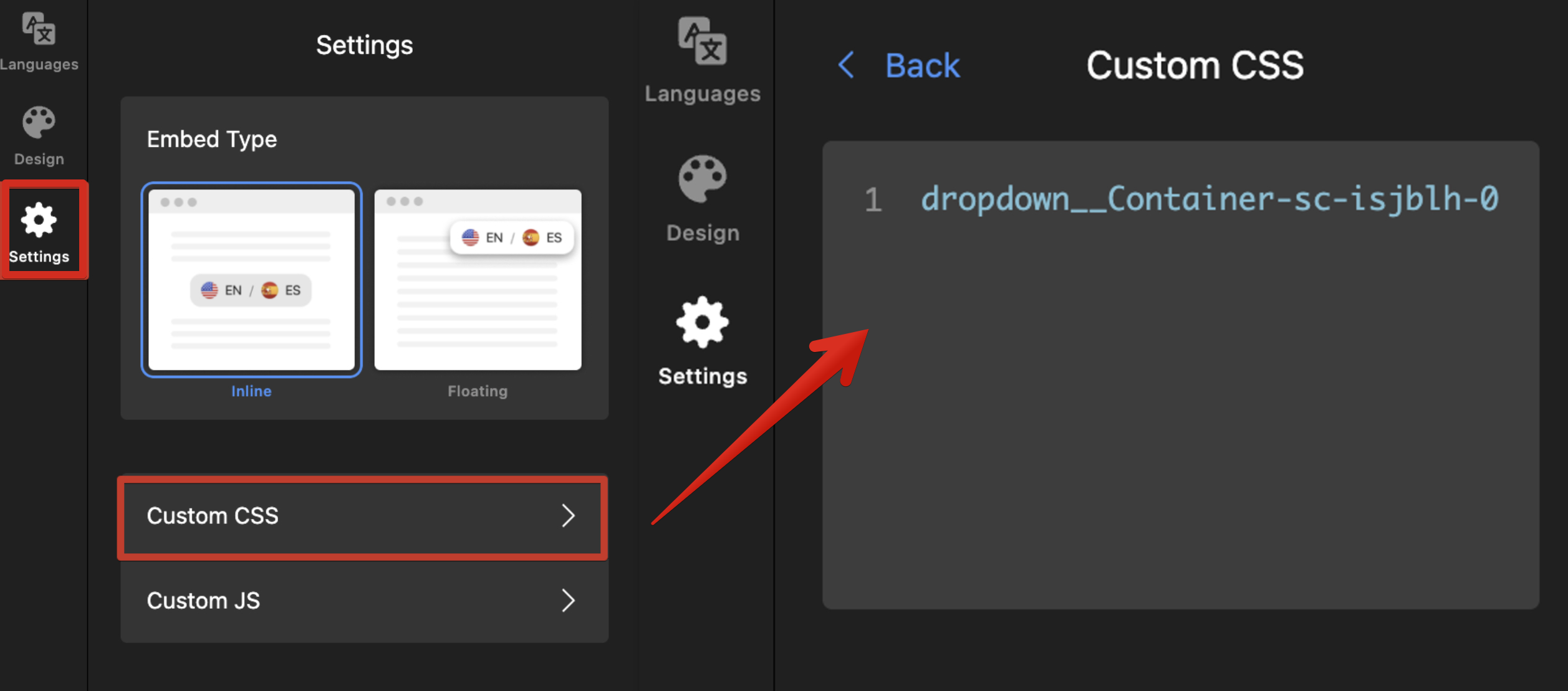
- 5
-
Check that you're using a stable class
The class in our example (dropdown__Container-sc-isjblh-0) includes a temporary suffix. Trim it to the base name to keep it stable and target it like this:[class*="dropdown__Container-sc"]
If you're using a stable class such as
es-title, just add a dot in front of it:.es-title. - 6
-
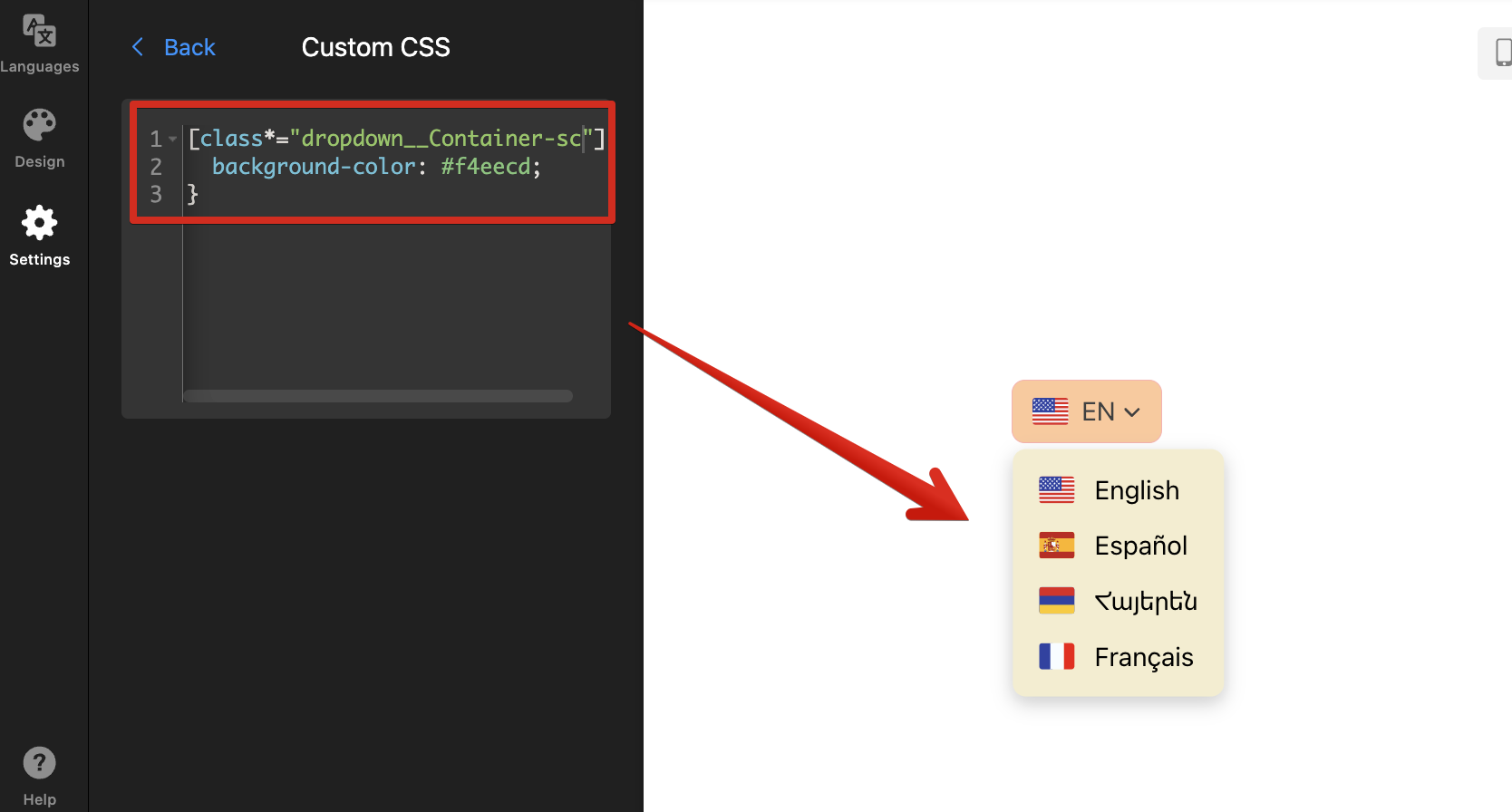
Apply CSS properties
Add curly braces after the class name and place your desired styles (font size, colors, padding, borders, etc.) inside. For example, we'll use this code to change the background color of the dropdown menu:
[class*="dropdown__Container-sc"] { background-color: #f4eecd; }To learn more about CSS rules and properties (like background-colororfont-size), check out this W3Schools guide: CSS Tutorial.You’ll see the changes applied in the editor immediately:


And that’s it! 🎉 Don’t forget to Publish your widget to apply your changes live on your website.
Tips for Mobile vs. Desktop CSS
All Elfsight widgets are responsive by default and automatically adjust to different screen sizes. However, you may want to customize their appearance on smaller screens, like adjusting height or font size for mobile devices.
You can achieve this using CSS media queries, which apply different styles based on screen size. Generally, screens up to 480px are considered mobile, while wider ones are tablets or desktops. You can adjust these breakpoints if your website uses different ones.
| For mobile screens only (up to 480px wide) ⬇︎ |
Wrap your styles inside @media (max-width: 480px) { … }. Here's an example:
@media (max-width: 480px) {
  .eapps-facebook-feed-content-container {
    height: 300px;
  }
} |
| For desktop screens only (from 481px wide and above) ⬇︎ |
Wrap your styles inside @media (min-width: 481px) { … }. For instance:
@media (min-width: 481px) {
  .eapps-facebook-feed-content-container {
    height: 500px;
  }
} |
In our examples above, the widget’s height is set to 300px on mobile and 500px on desktop. Feel free to use these media queries for your CSS!
Should you encounter any issues while working with CSS, don’t hesitate to reach out to our friendly Support Team for guidance! 😊